City of Dearborn
A redesign of the City of Dearborn, Michigan's navigation and permit fill-in process to enhance location of required forms, decrease completion time, and improve user satisfaction.
My Role
UX Research, UX Design
My Responsibilities
Research, wireframing, analysis, usability testing, prototyping, WCAG 2.1/2.2 compliance
Project Duration
3 months


City of Dearborn


A redesign of the City of Dearborn, Michigan's navigation and permit fill-in process to enhance location of required forms, decrease completion time, and improve user satisfaction.
My Role
UX Research, UX Design
My Resposibilities
Research, wireframing, analysis, usability testing, prototyping, WCAG 2.1/2.2 compliance
Project Duration
3 months
As mobile Internet usage becomes increasingly common, users expect to be able to complete tasks on their phones as easily as they do on a desktop. The City of Dearborn's forms and permits are integral parts of users' usage, but suffered from usability and navigation challenges that caused decreased productivity and lack of user trust.
-The Problem
-The Process
1. Discovery
2. Define
3. Ideate
4. Validate
1. Discovery
6 individuals - ages 23 to 63 - were asked to find a specific permit on the mobile site, then fill it out and locate where to send the permit as if they were going to submit it.
Cognitive Walkthrough
“It took me so long to find the right permit. You'd never know that there were more besides the two that you can see right away...having to zoom in and out repeatedly to find the right box to write in then fill out is really frustrating and time consuming.” - participant 3
"I can’t find it… am I allowed to ask for help from you [the interviewer]?" - participant 4
2. Define
Task analysis
.jpg)
We performed a task analysis to identify friction points in the permit process. A few specific points were identified, and further later supported by user Think Alouds, consisting of:
-
trouble locating permit due to horizontal scroll on mobile version of the site
-
poor usability in being able to edit and navigate the checkboxes of the PDF permit
-
only small portions of the permit card was clickable, causing users trouble knowing how to open the permit PDF once located
-
information was not saved if the user exited the permit PDF without downloading to their phone
User Personas

Kim Stevenson
Helpful student
Demographics
22, college student living in an on-campus house, very tech-savvy
Goals
-
wants to be able to fill out permits/forms on her bus ride to class
-
needs something that can she work on in small increments, must save her work
Pain Points
-
might not have all the information right then, so she wants to be able to enter what she knows now and come back later when she has the rest

Retired, fun grandfather
Ed Wilson
Demographics
70, retired, watches his grandchildren and realizes the street may need a stop sign, bad with technology
Goals
-
wants to be able to easily submit requests for changes on his street
-
needs to be user-friendly
Pain Points
-
Having to zoom in and out and switch between apps is hard with his lack of smartphone experience
-
Current PDF fill-in is too small

Sarah Daniels
Local businesswoman
Demographics
35, new mother, owns a local business, always on the go
Goals
-
needs to be able to work from anywhere with her busy lifestyle
-
wants to be able to efficiently work permits for her business
Pain Points
-
lack of saving her progress on a permit is frustrating when she needs to balance work, kids, and contractors
-
Horizontal scroll from gallery-style permit listing led to user confusion in locating the necessary permit
-
Using a PDF, rather than on site fillable forms, created longer times in completing the permits and increased user frustration from poor usability of the PDF
-
Trouble locating information on where to send the permit once completed
Core Gaps & Problems Identified
How might we redesign the permit/form fill-in process to reduce the number of steps needed, ease locating the desired permits, and improve the usability of the form?
Design Question
3. Ideate
-The Solution
Before

Homepage

Permit list
.png)
Permit page
After

Homepage

Permit list
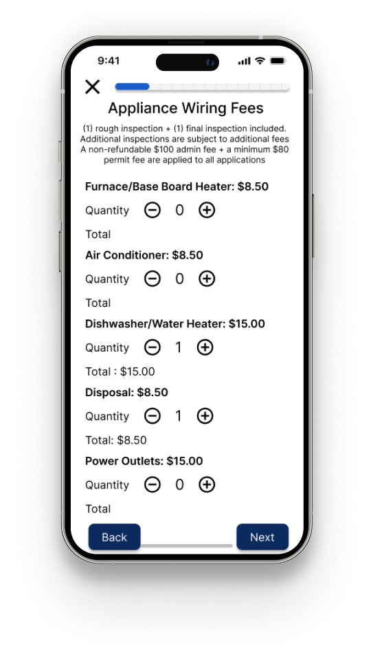
Permit page
Qualitative testing:
-
6 Think Aloud interviews with sentiment analysis
4. Validate
Quantitative testing:
-
Time to locate permit
-
Time to fill out permit
-
CSAT scoring
Qualitative analysis
Sentiment analysis
.png)
As we can see through the use of sentiment analysis, participants had a overall more positive experience filling out a permit using our redesigned permit portal system.
Quantitative Analysis
Time on task: locate permit

Participants were asked to locate a specific permit on both the current mobile system and our redesigned mobile system. The order in which participants performed the task (either current system first or redesigned system first) was randomized with three participants during current system first and three doing redesigned system first to negate bias. As the graph shows, participants were significantly faster in locating the permit using the redesigned system.
Time on task: complete permit

The same randomized order was used with this task. A statistically significant decrease in the time required to locate the permit was found. This shows we were able to improve users' experience in navigation and locating their desired permits.
CSAT scoring

-
Did you feel “stuck” at any point while using the site (e.g., trouble with navigation, unable to find your way through the site)?
-
Was it clear how to get back on track after an issue?
-
Were instructions and field labels clear enough to avoid mistakes?
-
Did the site keep you informed about what was happening (e.g., loading, saving, submitting)?
-
Were status messages (e.g., success/failure) easy to understand?
-
Did loading indicators or progress bars help you understand what was happening?
-
Overall, how satisfied were you with your experience using the mobile site?
All except for question 1 (did you feel "stuck" at any point while using the site) were found to have statistically significant improvement. This means were we able to truly improve the user experience.
Lesson Learned & Reflection
-
118% increase in user satisfaction
-
65.3% decrease in time taken to complete permit
-
42.7% decrease in time taken to locate permit
Wins
-
Of the user satisfaction, the progress bar is the only feature that user didn't report aiding feedback of system status. I propose a brighter blue or branding adding an accent color.
Challenges
This project reminded me that good UX in government services is about dignity and inclusion. A form or may seem small, but it represents access to benefits, permits and rights. The biggest shift in my practice was learning how to balance regulatory constraints with human-centered design. Instead of accepting compliance as a barrier, I reframed it as a design parameter - creativity with constraints made the solution stronger.
This experience deepened my belief that UX design is not just about interfaces, but about building trust in institutions.